The Colours of Infrared (1) (Fail!) (Photo 24)

Well, it was bound to happen at some point, and that point has arrived – I’ve failed miserably in my attempt to capture a photo for this week’s post! However, I have learned a fair bit in the process, which should hopefully help me to take a decent infrared (IR) shot in the future. I’m glad that there are two other photos using this technique, on the bucket list, as I’ve decided not to put up a featured photo because there really is nothing to be proud of! I will, however, try and share what I have learned (along with the photos I took), to help anybody who is equally surprised by the difficulty as I was.

Knowing that IR photography was on my list I have researched it from time to time, and basically came to the conclusion that I needed a specially converted camera, but then I saw a video on DigitalRev TV (see it here) which made me think that I would be able to achieve reasonable results with a filter on the front of my camera lens. So I ordered the Hoya Infrared (R72) Filter from Amazon, and looked forward to taking some great IR shots.

To see the potential of IR photography, take a look at some wonderful shots here – I underestimated the difficulty of achieving shots like those in a massive way.

Firstly, I should explain what IR photography is about, and that is using a camera to record the light that our eyes cannot see from the infrared area of the light spectrum. We humans can actually only see a fairly small proportion of the light that is around us, but camera sensors are sensitive to IR light although manufacturers add filters to block this light out to a large degree. This means that there are two ways in which you can allow your camera to record IR light – you can have the filter removed, which is probably expensive and restricts your camera to only taking IR photos, or you can buy a filter for the front of your lenses, which only allows IR light to pass through. The second option is much cheaper (around £30), but it does mean that you need to use long exposure times of at least a minute or two, to allow enough IR light to pass through the camera’s internal filter, which attempts to prevent the light from reaching the sensor. As I mentioned above, this is the option that I chose, and this is how my first test shot turned out.

My 1st test shot with the Hoya R72 filter attached to my NEX-6. I used a 2 minute exposure and an aperture of f/18

My 1st test shot with the Hoya R72 filter attached to my NEX-6. I used a 2 minute exposure and an aperture of f/18

As you can see, this is NOT how the IR photos I had seen look – not even close! What was I doing wrong?! Even now I am not 100% sure, but I do now know that the IR images that you can see around the Internet are not straight out of the camera – they require a fair amount of post-processing in Photoshop. The image is red because although the IR filters look black, they are in fact a very deep shade of red. I also took the above photo whilst it was somewhat overcast, which meant that there was not enough IR light being reflected off the green leaves and grass for them to turn the white shade that is customary in IR photos.

Being somewhat perturbed by my very red image, I decided to do some more research and scoured the Internet for more tutorials. I found that many of the tutorials did not really explain what to expect a straight-out-of-the-camera IR shot to look like, despite going through the various steps that you should follow when attempting such shots, and so I was still left a little bemused. For that reason I think it is important for somebody new to IR photography to be able to know what they should expect, to avoid the confusion that I was suffering at that point, so I will now take you through my journey of discovery! I do not have all of the answers, but I think that I can at least provide some help and understanding to people just starting out with this. The first thing that I realised I was doing wrong was that I was not setting a custom white balance, which should be set against green grass in good sunlight, so I quickly set this using Aperture 3 (one of the benefits of shooting in RAW format is that you can change the white balance when editing your shots, without any issues). This is how the above photo looked with a white balance set against the grass in the photo.

Adjusting the white balance helps to bring other colours through the red tint.

Adjusting the white balance helps to bring other colours through the red tint.

Changing the white balance has brought other colours to the surface, but everything is still heavily tinted by red. If you click on the image, you will also see a brighter spot in the centre, which is apparently as a result of using a long exposure with a filter on the lens, as the IR light is reflected off the camera’s own filter, and around the lens elements before landing back on the camera’s sensor – effectively over-exposing the centre of the image. This does not happen with all lenses, and so really you need to test your own kit to find a lens that works well. Of my E-Mount 16mm pancake, 18-55mm kit, and 55-210mm telephoto lenses, I found that the telephoto lens was the only one not to suffer from this hot spot. It so happens that this is the only lens of the three which has glass across the full diameter of it, with the front elements of the other two being smaller than the lenses themselves, which may or may not have something to do with it. The main problem with this is that a telephoto lens is not particularly ideal for taking landscape shots! If you have a converted camera though, I do not think this would be an issue.

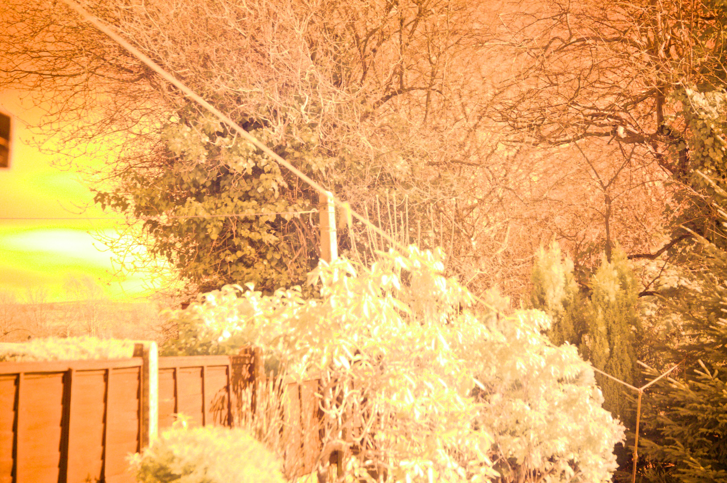
Another thing that I had read about IR photography was that you need very strong sunlight in order to get the best results, with midday shooting being advised for a change. The problem with living in Stockport is that many days can be overcast and wet, and so during Thursday and Friday I had no chance to take any more test shots. However, I had also read that IR light comes from any light source, even man-made light bulbs, so IR photography is also possible at night. This is backed up by some IR shots that I have come across being of night scenes, so I ventured out on Friday evening to have a go at taking shots of a church in Poynton which is lit up and also surrounded by fairly bright street lights. I decided to use an exposure time of 5 minutes, with a wide aperture to allow as much light in as possible. This is what I got in return.

5 minute exposure at night - the light trails are from cars on the roundabout, but none of the rest of the scene is visible!

5 minute exposure at night – the light trails are from cars on the roundabout, but none of the rest of the scene is visible!

Obviously, I was less than impressed once more, and so got straight back in the car and went home again! I had been taking some test shots in my kitchen earlier that evening, to prove to myself whether or not it was possible with artificial light, and also to test which lenses had a hot-spot, as well as taking the opportunity to experiment with the white balance settings. As I had at least been rewarded with more than just a black screen with those images, I was especially disappointed by the experience I had in Poynton. Here are a couple of the shots that I took of coloured chopping boards in my kitchen.

I did not set a custom white balance in camera for this shot - I set it in Aperture afterwards.

I set a custom white balance in camera, without the IR filter on the lens, for this shot.

I set a custom white balance in camera, without the IR filter on the lens, for this shot.

I set a custom white balance in camera, with the IR filter on the lens, for this shot.

I think that is probably safe to say that the custom white balance should be set without the IR filter on the camera’s lens, to avoid some overly green images, but then again – does it matter if your image is very green as opposed to very red?! If you can advise, please do so in the comments section at the bottom!

It probably makes sense to give you a quick checklist of things to do when taking your shots with an IR filter on the lens now:

  • Use a tripod for long exposures – you will probably need a minute or two depending upon the light.
  • Take your shots in Spring and/or Summers, when there are plenty of leaves on the trees to turn white in the final image.
  • Set a custom white balance, based on green grass in direct sunlight – I’m not convinced this is necessary though, as when I have played about with custom white balances in Aperture, it doesn’t seem to make a difference what area of the photo I choose as the white balance point!
  • Remove the IR filter from the lens in order to frame and focus your shot – use manual focus to prevent the camera trying to auto-focus when you take the shot. With the IR filter on, you will not be able to see anything other than a very dark red (if not black) image.
  • Use the Manual setting of your camera, and turn it to Bulb mode for exposures of more than 30 seconds – you will need a remote to achieve this without keeping your finger on the shutter release button.
  • Use a large aperture to allow plenty of light through the lens, although landscape photography is best with a smaller aperture to give a greater depth of focus – adjust exposure times to compensate for this.
  • Try to shoot on a still day – long exposures and wind don’t mix well if you want sharp images of trees!
  • Choose a bright, sunny day in order to get white leaves and grass.
  • Images with a lot of trees, water and sky seem to work well.

On Saturday I did manage to get a couple of shots in my back garden, when the sun decided to show for about 10 minutes. I could immediately see the difference this made to the leaves in the image.

I set the custom white balance without the IR filter on the lens for this shot. The bright sunshine turned the green leaves white at last!

I left the camera in auto white balance for this shot. The bright sunshine turned the green leaves white at last!

This shot looks the most like the odd out-of-camera shots that I did manage to find on the Internet, so I think that it probably makes sense to not bother setting a custom white balance in camera, and deal with that in your editing software. This is what changing the white balance in Aperture, based on the leaves, looks like – along with a few other exposure and definition changes.

Setting the white balance against the leaves made them much whiter.

Setting the white balance against the leaves made them much whiter.

I also took a shot after setting a custom white balance in camera, with the IR filter on the lens.

White balance set in camera, with IR filter on the lens.

White balance set in camera, with IR filter on the lens.

This looks dreadful, but by setting the white balance against the leaves again in Aperture, the final image came out like this.

In camera custom white balance set, but then changed in Aperture.

In camera custom white balance set, but then changed in Aperture.

To be honest, it doesn’t seem to matter how you set the white balance, and it probably makes sense to try doing so in different ways, as it then allows you to achieve different colours in the final image. The real magic happens when you move the image in to Photoshop and start playing with the channel mixer, and swapping the red and blue channels. You need the full version of Photoshop in order to this though, which is not cheap! I have Elements, which does not include the channel mixer, and so am currently unable to try and achieve a truly great IR photo look. There is a plug-in for Elements though, called Elements+, which promises to unlock the channel mixer, but I was unable to get this working in the short time that I had between realising the enormity of the task ahead of me and having to go and get drunk for a friend’s birthday!

I will of course be trying to get to the next step of IR photography in due course, but will be waiting for the leaves to come out on the trees, and I will also need to sort out access to photo software with a channel mixer! In the meantime, I hope that I have helped any newcomers to IR photography realise that they are not mad – it is just a lot harder to do than many of the tutorials on the Internet make it seem! Please leave any advice and comments that you may have, as I would really like to create a stunning IR image in the near future.

Photoshop Abstract (1) (Photo 21)

Photoshop Abstract (1)
NEX-6, 18-55mm E-Mount Lens @ 34mm, Aperture Priority Mode, 1/30 sec, ISO 3200, f/20

For the first of what will be two ‘Photoshop Abstract’ posts, I decided to have a go at creating some Pop Art. In the November ’12 issue of Digital Photo there was a tutorial on the accompanying Photoshop Video Lesson CD that shows you how to add this effect to your images, and so I thought it would make a good subject for this week’s post. The tutorial uses a head and shoulders portrait of a young girl, and so I decided to follow this theme and asked my friend, Mel, to model for me. As I was not really aware of what would make a good starting photo for this technique, or how I would be manipulating the image, the photos that I took were not really very ideal.

My very 1st attempt at Pop Art!

My very 1st attempt at Pop Art!

I will not run through a detailed tutorial of how to do this, but you start by adding a Threshold adjustment layer to your image, in Photoshop or Photoshop Elements. This turns your photo from colour to black OR white, and you can then adjust the threshold of where you want the pixels to be black OR white, from a pure white image to a pure black image, and everywhere in-between. You can see that my first attempt was not successful, with large areas of complete black and also areas without any black detail at all.

My 2nd attempt gave me some hope that I would be able to create something I was happy with.

My 2nd attempt gave me some hope that I would be able to create something I was happy with.

As I was not at all happy with the effect of my first attempt, I quickly added the colour and moved on to my second. I still was not exactly patting myself on the back, but I did feel that I was getting to grips with how to manipulate the image to bring out or hide various areas of detail. The good thing about this technique is that once you have chosen a threshold setting for the image as a whole, you can then pick out any area of your choosing, with the Lasso tool, and then add a Levels adjustment layer to fine tune the black/white ratio in that specific area of the image. You can see how I lightened Mel’s hair to the left of the image, and also her shoulders, for my second attempt. I should have then darkened other areas of her hair, to bring in a little more detail, but I was still getting to grips with how to go about doing this! I decided that I was happy enough, and then followed the tutorial on how to create a collage effect (with different colours in each copy of the image).

My 1st attempt at creating a Pop Art collage - I wasn't paying too much attention to what colours I chose!

My 1st attempt at creating a Pop Art collage – I wasn’t paying too much attention to what colours I chose!

From this early experience I began to understand that I would probably need a lighter starting image, with good contrast across the whole of my subject, to avoid the intense shadows that I was getting. This could be fixed with a lot of careful editing using the Lasso Tool and a lot of Levels adjustment layers, but it would be much quicker to get a well lit photo to begin with. It is also useful to have a very light background, so that you can remove any black from it easily to begin with, especially if you are trying to obtain this silk-screen printing effect, in the style of Andy Warhol, where the background is usually just a single block of colour. Something that I neglected to do when taking the photo for my second subject!

I couldn't resist the thought of turning Yoda into Pop Art - turns out he isn't a very good subject though!

I couldn’t resist the thought of turning Yoda into Pop Art – turns out he isn’t a very good subject though!

I really liked the idea of Yoda inspired Pop Art, but as he is just a ball of hair he doesn’t really have any contrasting features to add different colours to, in the way that a human has hair, skin, lips, clothes etc. I decided to try and make more of a feature of the background in the above image, to compensate for the lack of variety in the main subject, but all I have managed to do is give you a very good example of what not to do! Here is the original photo, which should help you to work out what everything is above:

Yoda, sleeping under my desk whilst I learn how to make Pop Art.

Yoda, sleeping under my desk whilst I learn how to make Pop Art.

As I was not having a great deal of success with my living subjects, I decided to have a go at seeing what could be done with some of the inanimate objects lying around my house. Most people have seen the Campbell’s Soup prints by Andy Warhol, so I decided to have a go with one of the cans of Heinz Tomato Soup in my cupboard, and I was immediately happier with the result.

Heinz Tomato Soup Can.

Heinz Tomato Soup Can.

Having gained a better understanding of what I was doing, both in terms of taking the original photo and also how to manipulate it in Photoshop, I was able to bring out most areas of detail in the soup can, giving the look of a printed image. I had set up a nice light background, against which to shoot the original photo, and I also tried a few different shots with my on-camera flash on/off/bounced off the ceiling etc. This was the original photo, which I cropped to leave only a small amount of background.

The starting photo for my Heinz Pop Art

The starting photo for my Heinz Pop Art.

I once again decided to try out the collage effect, going against the tutorial’s advice that once you start to go past 4 images you will begin to run out of colours to use! I do not think that this is necessarily true, but you do certainly have to put a lot more thought into it, and if you do not do so you can end up with something like this:

df

I also decided not to have a common colour running through this collage, such as leaving the writing yellow in each of the images, which I think would have helped to bring them all together nicely, but it would have added extra limitations to the colours available to me for the other areas of each copy.

I was just happy to have manipulated the photo into a black OR white image, and so I was not overly concerned about the colour scheme at this point – I was more interested in having another go with a fresh subject. It was at this point that I decided to take a photo of my trainers, as I thought that they might make an interesting subject, and so I set them up in the same place I had used for the soup can – Yoda’s cage, covered with a white(ish) blanket, against the light door of my wardrobe. I felt very professional indeed!

The cropped starting photo for the featured image.

The cropped starting photo for the featured image.

This was not an easy photo to convert into something that I was happy with, and took a great deal of extra Levels adjustment layers to get the right amount of detail in all of the various areas, but I was pretty happy with the final black OR white image, to which I added the following colour:

The starting point for creating a Pop Art collage. I kept the light blue of the tongues and soles in all of the final collage images, which I think has helped the overall effect.

The starting point for creating a Pop Art collage. I kept the light blue of the tongues and soles in all of the final collage images, which I think has helped the overall effect.

I decided to use my trainers for the featured image of this post because of the amount of effort that I put into creating the image. Effort which was doubled today, as I was forced to start from scratch because I had done something wrong (I do not know what) which resulted in the file size being far too large to add to my blog without crashing Safari! Anyhow, in a way I am quite glad, because it gave me a chance to alter a couple of things that I wasn’t overly happy with in the original attempt, and I think that I have ended up with a better balance of colours throughout the collage.

I was not finished with my trainers though, and thought that it would be interesting to have a go at an image using my Playstation Vita. This would be a fairly straightforward attempt, with the majority of the Vita in black – I just needed to select the screen, turn it to white, and then add colour to it. The rest of the device could be manipulated fairly easily, as I just needed to create a few highlights around the controls and writing.

The starting photograph, again using my makeshift studio!

The starting photograph, again using my makeshift studio!

The buttons on the Vita are all white, but I decided to add the standard Playstation colours. I also chose to desaturate the colours I was using, as I felt that my previous images were a little on the gaudy side! Here is the original image I created:

My PS Vita Pop Art.

My PS Vita Pop Art.

I chose to keep the original Playstation button colours for all of the images in the collage I then created, as well as leaving the PS Vita and Sony writing white, in order to keep a little consistency in the images of the final collage. I quite like the slightly duller colours which do not offend the eyes quite so much as my earlier attempts.

My final Pop Art collage for this week's post.

My final Pop Art collage for this week’s post.

By the end of my attempts at creating Pop Art I can safely say that it is quite an interesting way of creating striking images. You do have to give a fair amount of consideration to the original photos that you take, being careful to get the background and lighting right to avoid unnecessary work being required in Photoshop. As with almost everything else I tackle, there are plenty of other people’s images to see by typing ‘Pop Art’ into Google Images. Please do share your own attempts on Sony UK’s Facebook and Flickr pages though, and also feel free to leave any comments here too.

Painting With Light (Photo 18)

Painting With LightNEX-5N, 16mm E-Mount Lens, Manual Mode, 6.0 sec, ISO 100, f/6.3

Painting With Light
NEX-5N, 16mm E-Mount Lens, Manual Mode, 6.0 sec, ISO 100, f/6.3

Over the last 12 months I have read quite a lot about photography, and I have lost count of how many times people mention that the word ‘photography’ literally means ‘painting with light’, so I thought that I’d pass that little kernel of information on to anybody who reads this (in case you have not read it somewhere else quite yet). I have tried out a few different techniques this last week, with varying degrees of success, but I like how the featured shot turned out – simple but effective (in my opinion at least). I still have a couple of other ideas to try, but may not get the chance to do so just yet, so I have decided to stick with what I have and add my post.

I started off simply by writing in the air, using a torch. I used a long exposure, to capture the full trail of light that I made.

I started off simply by writing in the air, using a torch. I used a long exposure, to capture the full trail of light that I made.

As I mentioned last week, I’m not really a very good artist, so I knew that I would find drawing things with a torch rather challenging. Although it was frustrating at times, it was also quite good fun, especially when you don’t have much else to do on a dark, cold evening! I took a few test shots in my hallway to begin with, and started off by writing the first thing that came in to my head, which was a small tribute to the people at Sony UK. The above image is actually 3 shots – I wrote ‘Sony’ in one, ‘U’ in the second, and ‘K’ in the third, having set my camera up on the tripod, turned it to Manual Mode and lowered the shutter speed right the way down to BULB Mode. I then took my old Maglite torch (the brand is important, as you’ll see in a bit), released the camera’s shutter using my remote control, and traced ‘Sony’ in the air, trying my best to keep the torch light facing straight at the camera. I had to end the shot as soon as I had finished writing, so as not to get any extra lines of light in the picture, using the remote control (which seems to be working properly again after its failure on me in Blackpool). I used three photos to avoid having to join ‘Sony’ up to the ‘U’ and the ‘K’, and then put them together using Photoshop Elements 10. This also allowed me to add different colours to the three different shots, but I left UK the same colour – the Maglite’s bulb gives off a white light in reality, as you can see in the next shot I attempted:

I had a grand ideas for drawing a whole family scene, but spared my blushes by leaving it at this!

I had grand ideas for drawing a whole family scene, but spared my blushes by leaving it at this!

Whilst researching ideas for what sort of images to take this week, I came across my inspiration for attempting to draw a figure (it actually turned out better than I had expected, which tells you a lot probably!) – to see some seriously impressive light drawings, you should take a look at Michael Bosanko’s work, and also something similar (in terms of drawing people), which I came across a little later – rafoto. I think that I may have found the whole experience a little easier if I had been using a torch that switches on and off with the click of a button, rather than needing to turn the head which would result in extra light being added to the scene, and means every move you make is going to be captured. However, the Maglite’s twisty head is a blessing in another way, which is that it allows you to remove the head and expose the bulb – this gives a finer point of light, but lights the room like a candle in the process. I used this mode to have a go at creating my first light orb – I then took a shot of myself to add in and see how it might look with somebody behind it. Please remember that these were all test shots to see what sort of things I would be able to manage, so no thought went in to the location or other incidental details – I was using my fish-eye converter for the 16mm pancake lens, to see if that added anything to the overall effect:

Creating perfect orbs is not very easy!

Creating perfect orbs is not very easy – especially on your 1st attempt, using stiff wire instead of string to swing your light with!

I used the camera’s flash to take the photo of myself, and you can see the shadow cast by having the fish-eye converter attached. Which reminds me actually – this was the first time I have been able to use my new NEX-6 for anything other than taking photos of objects on my desk whilst playing with different settings! I decided not to use the fish-eye lens on my second attempts, but I did manage to get a shot of Yoda for a bit of variety – I edited it using CameraBag 2, which gives you loads of great artistic filters to add to your shots, and can be found on the Mac App Store.

Yoda wasn't impressed with me swinging lights around, so he went upstairs until I turned the house lights back on.

Yoda wasn’t impressed with me swinging lights around, so he went upstairs until I turned the house lights back on.

The basic principle of creating an orb is that you need to start swinging a light in a circle, along a vertical plane, and then rotate through 180 degrees (not putting yourself between the light and the camera preferably!). However, you need to rotate around your own hand, which is easier said than done, if you want to create as perfect a sphere as possible. I did have another go with some different lights the following night, and was slightly more successful:

3 different orbs I captured, using red and white LEDs

3 different orbs I captured, using red and white LEDs

You can see that I managed to rotate more closely around my hand, but you can also see that it is important to keep moving, or else you end up with uneven light trails. Having had a go at drawing in the air and creating a light orb, I decided to try out a technique I came across in the February edition of Digital Photo magazine, where you draw around objects using the candle mode of a small Maglite. It is best if you draw around different areas of your scene in separate shots, so that if you make a mistake it doesn’t ruin the whole image, and also so that you are able to add different colours to the various areas of the photo, using Photoshop. I drew around different areas of this fireplace and mirror, before combining them, but I did not alter the colours at this stage. It is probably a good idea to point out that you should NOT move your camera at all in between taking each shot, because otherwise your final images will not match up properly, and at best it will look as though you have a double exposure of the object you are painting with light.

I hadn't been drinking, but my hand wasn't very steady (maybe it would've been better if I had been doing so).

I hadn’t been drinking, but my hand wasn’t very steady (maybe it would’ve been better if I had done so).

I decided to call it a night at this point, and return to the project the next evening after I had been able to look for new ideas and techniques to try out. It was one of these techniques which resulted in the featured image for this post, which involves you pointing your camera to the ceiling and dangling a light from a piece of string above it. As with most other light painting shots, you need to set long exposures to capture the movement of the light over a number of seconds. After failing to secure my torch with blu-tack and bending drawing pins that I attempted to push in to the ceiling, I decided to use the handle of a high up cupboard in my hallway to hang the string from, which turned out to be very helpful as it allowed me to alter the height of the lights during the exposure, for different effects. I used the Maglite to begin with, set it swinging and opened the camera’s shutter with the remote, before pulling the string to raise the torch, which meant that the circumference of its swing reduced the closer it got to the door handle. The affect that this had was to produce spiral shapes in the final images. I also secured the torch at a set height, made it swing and then pushed it in different directions during the course of the exposure. My shapes were not particularly good compared to some perfect geometric shapes I had seen on the internet, but here are a few examples which I have put together using Diptic (also available on the Mac and iOS App Stores):

5 Different attempts at swinging the torch from a string, above my camera.

5 Different attempts at swinging the torch from a string, above my camera.

Having played around with the Maglite for a while, I decided to use a couple of LED type lights – they are just small, cheap ones that you can buy to attach to a bicycle, but they flash quickly, slowly, or stay lit without flashing. This allowed me to obtain different effects, and I also combined the two lights together (on two strings), in a variety of ways which you can see the results of here:

A few examples of the different effects possible when using two LED lights and swinging them in different ways. I put them together using Diptic for Mac.

A few examples of the different effects possible when using two LED lights and swinging them in different ways. I put them together using Diptic for Mac.

The featured image is a combination of both lights swinging in the same arc, together. I chose it because the spiral is nice and uniform, which means that I probably raised the lights at a steady pace. The LED lights I used have translucent bodies, which allowed light to escape and show the surrounding area of walls and ceiling, so I added heavy vignetting and also burned around the lights in Aperture 3 – you can probably still see a white line, which is the cupboard door, if you look closely enough.

Having run out of ideas for how to swing the lights any differently, I decided to return to painting around the fireplace, so took the head off the Maglite and set up my camera to take shots there. Unfortunately, after a few failed attempts, I managed to plant the seemingly delicate, exposed bulb straight in to the slate base of the fireplace. It didn’t smash or spark – simply turned off and wouldn’t come back to life. I eventually decided to use the white LED light, but it is very bright and gives a much thicker line of light – however, I finally managed to get three shots – one of the fireplace, one of the surround of the fire, and one of the central area of the fire (complete with some dodgy, fake flames!). I once again layered them together in Photoshop, and this time changed the hue of each shot. The LED is such a bright white though, that it is difficult to change the colour of the actual light trails, and the effect is applied more to the surrounding glow – I tried two different colour schemes, and ended up placing them together as mirror images, using Diptic to frame them into one image:

Not subtle or particularly pleasing to the eye, but hopefully you get the general idea of the technique that I was using.

Not subtle or particularly pleasing to the eye, but hopefully you get the general idea of the technique that I was using.

There was one other technique that I was interested in trying out for this post, which is using sparklers to trace around objects (outdoors, unless you’re name is Mario Balotelli!), so as I woke up early this morning I decided to take a drive to take some photos of the snow, and also to try a quick shot of me running sparklers around the lines of my car – I bought some sparklers last week for this purpose, and they aren’t too easy to find at this time of year. I had to go to a local newsagents who seems to sell fireworks all year round, so I can’t really advise where the best place would be in general. Anyhow, I had set up my camera on the tripod, with a reasonable backdrop behind my car and the first light of day starting to appear, only to realise that I had left the remote control at home (after using it for various shots the previous nights). I could have maybe gotten away with setting the camera to a 30 second exposure and also delaying the shutter release for 10 seconds to give me time to get across the road to my car, but it was early and my brain wasn’t working quickly enough to think of doing that, so I set up to take some shots of the sunrise over a lake surrounded by snow-covered landscape. I will save them for another time, but I was happy with the last shot of the day – a reflection of the landscape in my car windows, which I altered heavily using the CameraBag 2 software that I have discovered recently. Here is the original and the final version:

A quick shot of the landscape's reflection in my car window.

A quick shot of the landscape’s reflection in my car window.

The same photo, but with an artistic filter applied, using CameraBag 2.

The same photo, but with an artistic filter applied, using CameraBag 2. I like it the contrast that it adds to the clouds in the black and white area.

Well, hopefully I have been able to give you a few ideas to try, but if you are interested in this type of photography then type ‘painting with light photos’ in to Google and there are loads of amazing hints, tips and ideas to try there.