
")
Photoshop Abstract (1)
NEX-6, 18-55mm E-Mount Lens @ 34mm, Aperture Priority Mode, 1/30 sec, ISO 3200, f/20
For the first of what will be two ‘Photoshop Abstract’ posts, I decided to have a go at creating some Pop Art. In the November ’12 issue of Digital Photo there was a tutorial on the accompanying Photoshop Video Lesson CD that shows you how to add this effect to your images, and so I thought it would make a good subject for this week’s post. The tutorial uses a head and shoulders portrait of a young girl, and so I decided to follow this theme and asked my friend, Mel, to model for me. As I was not really aware of what would make a good starting photo for this technique, or how I would be manipulating the image, the photos that I took were not really very ideal.

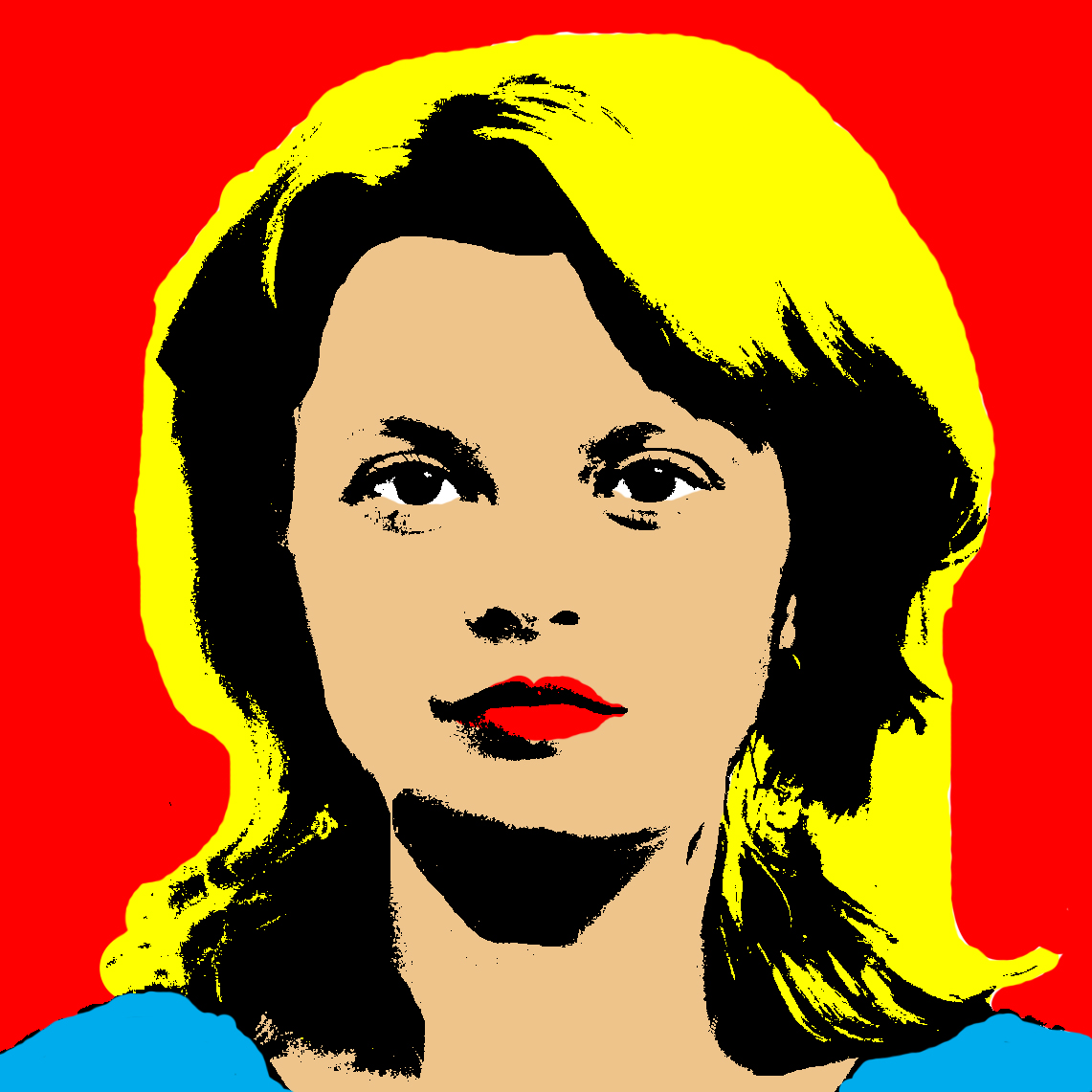
My very 1st attempt at Pop Art!
I will not run through a detailed tutorial of how to do this, but you start by adding a Threshold adjustment layer to your image, in Photoshop or Photoshop Elements. This turns your photo from colour to black OR white, and you can then adjust the threshold of where you want the pixels to be black OR white, from a pure white image to a pure black image, and everywhere in-between. You can see that my first attempt was not successful, with large areas of complete black and also areas without any black detail at all.
My 2nd attempt gave me some hope that I would be able to create something I was happy with.
As I was not at all happy with the effect of my first attempt, I quickly added the colour and moved on to my second. I still was not exactly patting myself on the back, but I did feel that I was getting to grips with how to manipulate the image to bring out or hide various areas of detail. The good thing about this technique is that once you have chosen a threshold setting for the image as a whole, you can then pick out any area of your choosing, with the Lasso tool, and then add a Levels adjustment layer to fine tune the black/white ratio in that specific area of the image. You can see how I lightened Mel’s hair to the left of the image, and also her shoulders, for my second attempt. I should have then darkened other areas of her hair, to bring in a little more detail, but I was still getting to grips with how to go about doing this! I decided that I was happy enough, and then followed the tutorial on how to create a collage effect (with different colours in each copy of the image).

My 1st attempt at creating a Pop Art collage – I wasn’t paying too much attention to what colours I chose!
From this early experience I began to understand that I would probably need a lighter starting image, with good contrast across the whole of my subject, to avoid the intense shadows that I was getting. This could be fixed with a lot of careful editing using the Lasso Tool and a lot of Levels adjustment layers, but it would be much quicker to get a well lit photo to begin with. It is also useful to have a very light background, so that you can remove any black from it easily to begin with, especially if you are trying to obtain this silk-screen printing effect, in the style of Andy Warhol, where the background is usually just a single block of colour. Something that I neglected to do when taking the photo for my second subject!

I couldn’t resist the thought of turning Yoda into Pop Art – turns out he isn’t a very good subject though!
I really liked the idea of Yoda inspired Pop Art, but as he is just a ball of hair he doesn’t really have any contrasting features to add different colours to, in the way that a human has hair, skin, lips, clothes etc. I decided to try and make more of a feature of the background in the above image, to compensate for the lack of variety in the main subject, but all I have managed to do is give you a very good example of what not to do! Here is the original photo, which should help you to work out what everything is above:

Yoda, sleeping under my desk whilst I learn how to make Pop Art.
As I was not having a great deal of success with my living subjects, I decided to have a go at seeing what could be done with some of the inanimate objects lying around my house. Most people have seen the Campbell’s Soup prints by Andy Warhol, so I decided to have a go with one of the cans of Heinz Tomato Soup in my cupboard, and I was immediately happier with the result.

Heinz Tomato Soup Can.
Having gained a better understanding of what I was doing, both in terms of taking the original photo and also how to manipulate it in Photoshop, I was able to bring out most areas of detail in the soup can, giving the look of a printed image. I had set up a nice light background, against which to shoot the original photo, and I also tried a few different shots with my on-camera flash on/off/bounced off the ceiling etc. This was the original photo, which I cropped to leave only a small amount of background.

The starting photo for my Heinz Pop Art.
I once again decided to try out the collage effect, going against the tutorial’s advice that once you start to go past 4 images you will begin to run out of colours to use! I do not think that this is necessarily true, but you do certainly have to put a lot more thought into it, and if you do not do so you can end up with something like this:

I also decided not to have a common colour running through this collage, such as leaving the writing yellow in each of the images, which I think would have helped to bring them all together nicely, but it would have added extra limitations to the colours available to me for the other areas of each copy.
I was just happy to have manipulated the photo into a black OR white image, and so I was not overly concerned about the colour scheme at this point – I was more interested in having another go with a fresh subject. It was at this point that I decided to take a photo of my trainers, as I thought that they might make an interesting subject, and so I set them up in the same place I had used for the soup can – Yoda’s cage, covered with a white(ish) blanket, against the light door of my wardrobe. I felt very professional indeed!
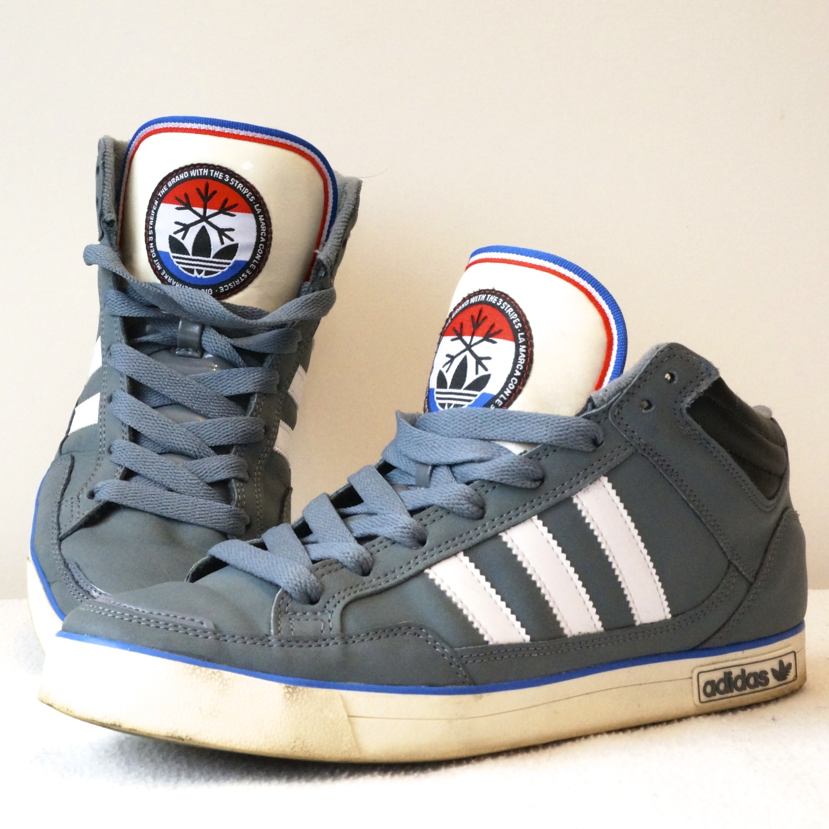
The cropped starting photo for the featured image.
This was not an easy photo to convert into something that I was happy with, and took a great deal of extra Levels adjustment layers to get the right amount of detail in all of the various areas, but I was pretty happy with the final black OR white image, to which I added the following colour:

The starting point for creating a Pop Art collage. I kept the light blue of the tongues and soles in all of the final collage images, which I think has helped the overall effect.
I decided to use my trainers for the featured image of this post because of the amount of effort that I put into creating the image. Effort which was doubled today, as I was forced to start from scratch because I had done something wrong (I do not know what) which resulted in the file size being far too large to add to my blog without crashing Safari! Anyhow, in a way I am quite glad, because it gave me a chance to alter a couple of things that I wasn’t overly happy with in the original attempt, and I think that I have ended up with a better balance of colours throughout the collage.
I was not finished with my trainers though, and thought that it would be interesting to have a go at an image using my Playstation Vita. This would be a fairly straightforward attempt, with the majority of the Vita in black – I just needed to select the screen, turn it to white, and then add colour to it. The rest of the device could be manipulated fairly easily, as I just needed to create a few highlights around the controls and writing.
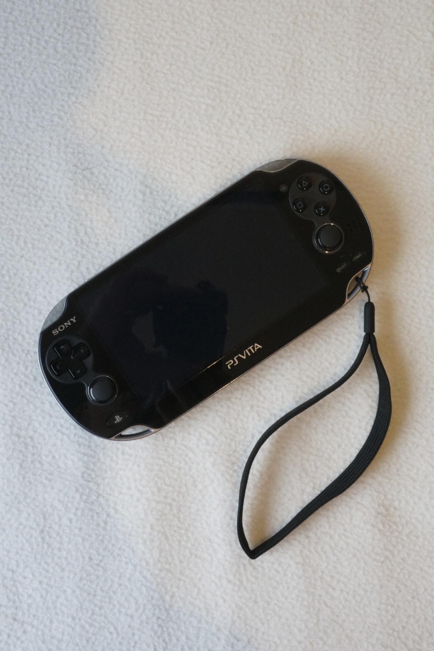
The starting photograph, again using my makeshift studio!
The buttons on the Vita are all white, but I decided to add the standard Playstation colours. I also chose to desaturate the colours I was using, as I felt that my previous images were a little on the gaudy side! Here is the original image I created:

My PS Vita Pop Art.
I chose to keep the original Playstation button colours for all of the images in the collage I then created, as well as leaving the PS Vita and Sony writing white, in order to keep a little consistency in the images of the final collage. I quite like the slightly duller colours which do not offend the eyes quite so much as my earlier attempts.

My final Pop Art collage for this week’s post.
By the end of my attempts at creating Pop Art I can safely say that it is quite an interesting way of creating striking images. You do have to give a fair amount of consideration to the original photos that you take, being careful to get the background and lighting right to avoid unnecessary work being required in Photoshop. As with almost everything else I tackle, there are plenty of other people’s images to see by typing ‘Pop Art’ into Google Images. Please do share your own attempts on Sony UK’s Facebook and Flickr pages though, and also feel free to leave any comments here too.
